THE REAL-WORLD IMPLICATIONS OF THE RISE OF PASSIVE INVESTING IN RICHLY OVERPRICED MARKETS AND HOW INVESTORS SHOULD NOW BE THINKING ABOUT THEIR PORTFOLIOS AND THE CURRENT MARKET
PART I: PASSIVE INVESTING
Passive investing through exchange traded funds (“ETF”s) puts money to work in markets and by doing so defeats it’s very essences as “passive” by the act of investing. What then is the impact of ETF (passive) investing versus “active” investing and why does it matter?
I cannot articulate a response more brilliantly than Mike Green of Simplify Asset Management presented here: https://youtu.be/vvGSKBZptLo?si=1Xc-IbxnwW-_tWiJ
Hereafter, I simply reduce to writing what Mike has to say in his YouTube presentation about passive investing:
Passive investing is creating a distortion in the market which is changing the very features and behaviors of the market which will overwhelm liquidity in the market, causing a market collapse. It presumes that these investors have done appropriate research: discounted cash flow analyses, et al. before putting money to work, which is a false supposition. So, with this dilemma the question becomes: can the passive investor get out ahead of the next market meltdown? Because more and more people are crowding into passive products, it’s becoming harder and harder for active investors to beat an index. Regulators should recognize the damage that’s being caused. Passive equals monopoly, now 45 percent of the market.
Part of the reason why I (Mike Green) is speaking out is not because I actually think that I can change anything now but when the adverse result of passive investing actually occurs, I want people to hold Vanguard’s feet to the fire and say “wait, we’re not doing this again!” much the same way that we did in 1933-1934 when the Pecora Commission reset Wall Street: It declared that Wall Street’s purpose is not rampant speculation, but to attract investment that requires a degree of honesty and trust and good behavior in markets. That realignment allowed markets to successfully fund any number of activities over the next 70 years.
It wasn’t until the late 1960s and early 1970s that we began to talk about “indices” or the “efficient market hypothesis” that presumed that the underlying work associated with equity analysis had been done by others. I.e., the purchaser of an index fund or the fund sponsors were off the “due diligence hook.” Subsequently, the Pension Protection Act became law in 2006 creating the Qualified Default Investment Alternative (“QDIA”) that turned 401Ks from “opt in” vehicles to “opt out” which had the effect of greatly increasing employees’ participation and purchasing of “cookie cutter” indexed funds from a few sponsoring companies at the time – Vanguard and Blackrock. Then, in 2012 Vanguard lobbying succeeded in changing QDIA balanced funds to target date funds. These events further distorted markets going forward.
Next Page ® From an investment view, the effect of all this is depicted in this Chart 1:
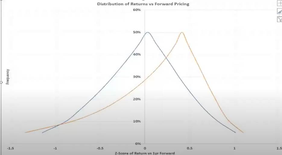
This is what Michael Green thinks about stocks. It can literally be thought of as simple as this: A kind of structural distribution that is historically skewed slightly positive with tails fatter to the downside then to the upside. This is the world that we looked at around 2000. This is what my models would have suggested we should have had (blue line) then. It was true for the majority of stocks, even as we had an isolated bubble to low-float stocks associated with the dot.com cycle. What has happened is we’ve shifted the center point of that distribution to the right (yellow line) so, on average, stocks win more frequently than they used to. But they also have much fatter tails, the point being: I absolutely think that for the vast majority of people, the right strategy is to be invested. I also think from an individual and societal standpoint you need to be very aware that, if this outcome occurs, it’s going to be far worse than you think. That’s really what it boils down to. So, I’m perfectly happy to have people say stocks are guaranteed to continue to march upwards. The things that can cause losses is a structural rise in unemployment, i.e., a decrease in contributions and continued rising valuations ultimately should lead to more and more wealth concentration among the asset owning-class. We’ve absolutely seen that play out and, as their income and wealth rise, they’ll start to make withdrawals and spend more.
The really key thing to remember is that withdrawals are always a function of asset-levels; contributions are always a function of income levels. And so, as something like stock market cap to GDP (it’s currently at the highest levels it’s ever been in history), as it continues to rise you eventually get to the point where the outflows outweigh the inflows. Then you have to find the next marginal buyer, and that’s what a crash really is — it’s where money has flowed in and I don’t care what the price is because I know this is going up. And then once it starts to go down your next marginal buyer is down between 30 and 80 percent.
Mike Green concludes: It fits the Hemingway quote (How did you go bankrupt? Slowly and then all at once.) in reverse: How did you get rich? Slowly and then all at once – again, a function of inflated returns of the last twenty-five years of passive investing to the point that outflows are exceeding inflows because passive investing created a distortion in the market which changed the very features and behaviors of the market, overwhelming liquidity in the market and causing an inevitable market collapse.
DAN STEELE’S COMMENTARY:
Mike Green’s prescient presentation boils down to one thing for you and I and our investing in today’s equities marketplace: R I S K. And I propose the best way to understand risk here is to study Mike Green’s chart comparing his two distribution arks – one blue and the other yellow, which are a graphical depiction (the Z score) of a graph like this one which he discussed at time maker 24:07 of his presentation:
To viscerally smell and taste the risk associated with Chart 1 on page 2, I propose that we move it in with a standard deviation measuring graph, Chart 2:
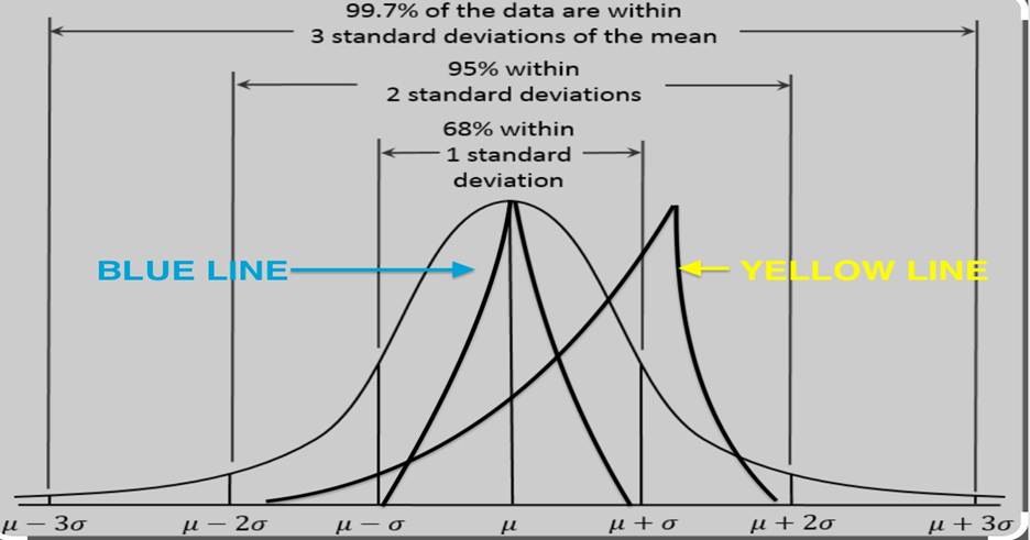
In modern portfolio theory, standard deviation (“SD”) is used to determine the range of possible outcomes of future performance. It also measures volatility as a measurement of risk. The higher the standard deviation of possible outcomes, a/k/a volatility, the greater the risk. SD measures the volatility or risk of an investment by showing how much its returns deviate from their average. Higher deviations indicate greater risk and potential for larger swings in returns.
Chart 2 tells us (1) that the blue-lined ark, circa year 2000, generally performed within one SD, meaning that disbursements were contained 68 percent of the time within one SD and that volatility was limited; and (2) since then, the yellow-lined ark, shifting to the right, expanded to two SDs. While stocks win more frequently than they used to and disbursements are contained 98 percent of the time by virtue of the wider spread of fatter ark tails (particularly the left tail), volatility doubled.
PART II: RICHLY OVERPRICED INDICES
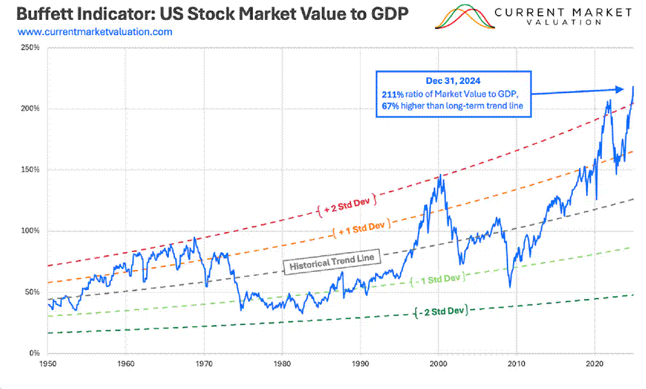
The increasing volatility story discussed above is all confirmed by the Buffett Indicator:
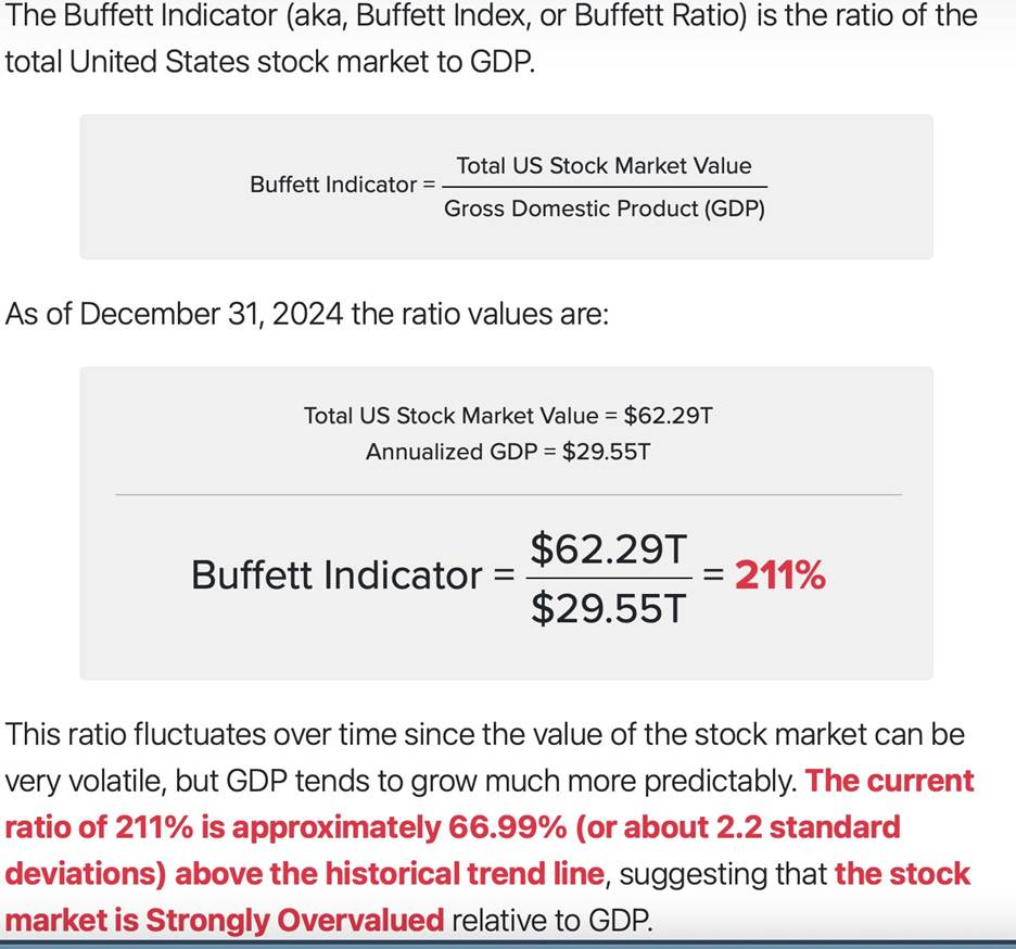
The Buffet Indicator historical trend line validates Mike Green’s narrative about the post 2000 indexinfused changes in markets and resulting increased market volatility from one SD (1975-1999) to two SDs in 2000 and its exceeding two SDs post 2020.
Another measure of equities market risk is the so-called cyclically adjusted or Shiller price-to-earnings ratio named after Nobel Prize winner and Yale finance professor Robert Shiller. This ratio compares stock prices to the average corporate earnings of the past decade, adjusted for inflation. Shiller was awarded the Nobel Prize for economics for showing how it had been a powerful predictor of future investment returns. The current ratio is higher than its peak in 1929 (when it hit 33), let alone the late 1960s (when it was just 22). Both proved terrible times for investors. By this measure, the S&P 500 has only been more expensive on two occasions before the third quarter 2024: during the greatest bubble in history from 1998 to 2001, and during the post-COVID mania of 2021-22. The ratio currently values the S&P 500 at 36.5 percent times earnings.
CONCLUSION
Passive investing and richly valued markets are a two-punch knockout for investors going forward. Passive investing, now comprising 45 percent of markets, will continue until regulators reform markets to reflect fundamentally and transparent fair values. Market capitalizations, on the other hand, will decline precipitously, maybe as much as 50 percent from here. Unprecedented debt portends an overall sustained market decline/bottom akin to the 2000 – 2013 market-leveling period.
As a savvy investor, you will periodically follow both market capitalization indicators, discussed above, here: www.longtermtrends.com This site presents beautiful long-term charts of the Buffett Indicator (“Wilshire 5000 to GDP Ratio”) and the Shiller price-to-earnings ratio (“S&P 500 to GDP Ratio”).
For your investment health and well-being, Dan Steele